SEO for Startups - Three: Test
30 August 2016
By H
< Two: Optimise your content / Four: Promote >
Once you’ve got your would-be customers onto your website, you don’t want to lose them due to poor user experience (UX). One of the biggest causes of drop-off on a website is broken or bad functionality. So it’s really important to work through the key elements of your website and make sure that everything works as it should and that navigating the website is logical and easy.
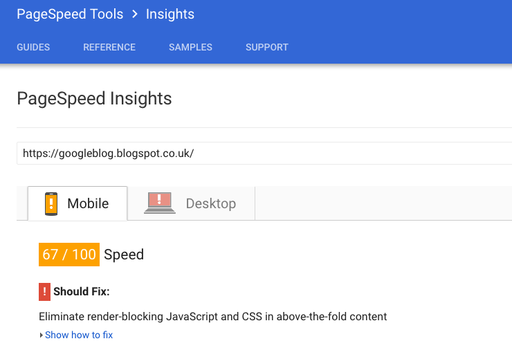
Digging back into the Google toolbox there are two great tools for helping to identify areas you can improve your website’s UX. Firstly, page load speed. Nearly half of web users expect a page to load in under 2 seconds, and tend to abandon a website if it takes more than 3 seconds to load. Therefore, it is important to make sure that your landing pages are loading quickly and your page load speed is a key signal in Google’s algorithm. Google’s PageSpeed Insights tool will run an analysis of your landing page and give a score for both desktop and mobile, with a breakdown of what can be improved. Now, generally we find that this tool is quite strict and we’ve tested pages that load well under 2 seconds that have returned scores in the 70-80 region. In the example below, even Google’s own blog returns an apparent low score so don’t worry too much if your website is scoring in region above 50. Some of the recommended actions to improve your score require some serious recoding or restructuring. That said, it’s still a good guide of how quick your landing page loads and you can always test your landing pages against your search competitors.
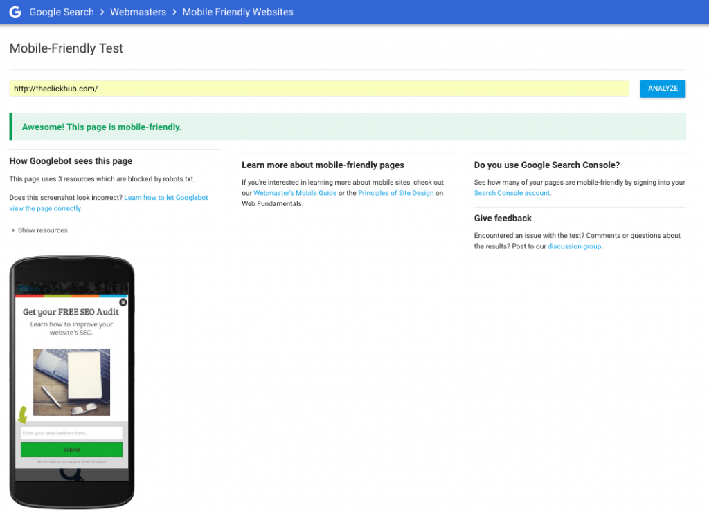
Secondly, is your landing page mobile-friendly. Since Google announced that more than half of searches are carried out on mobile, it has put greater emphasis on rewarding mobile-friendly landing pages. Fortunately, they have another tool to help here which, unlike the PageSpeed Insights tool, returns a simple yes or no result. If you are using a CMS such as WordPress or Shopify, it’s likely your website is mobile-friendly by default.
It is always worth testing your web pages on a range of different devices, however. Even if your website is technically mobile-friendly and responsive, sometimes buttons and links appear too small and difficult to use or your imagery is spoilt due to the resizing process.
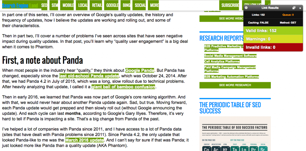
A common fault we come across is broken links. Not only is this bad for UX and spoils your conversion path, but broken links are identified by Google’s bots and can negatively effect your ranking. Broken links are an easy error, even with sophisticated CMS that automatically update links if you change a page’s URL. The tool we would recommend for identifying this is a simple Chrome extension called Check My Links. This tool allows you to quickly run a scan on a page and will flag any links that return a 404 error. You can then go into the backend and fix these.
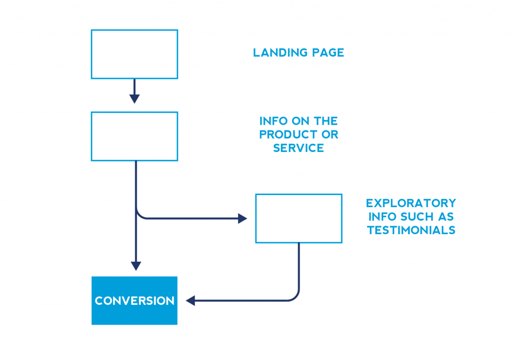
Finally check that your conversion path is well thought-out and is easy to navigate. This is the path a user would take from landing on the website to making a purchase or enquiry. You need to provide clear call-to-actions to allow and even tempt the user to progress through each stage. Since you either designed or were heavily involved in the designing of the website, you’re probably very familiar with where everything is. Therefore, it’s invaluable to get other people to work through the website and give you feedback. This will help you to identify problems with navigating the site or functionality issues. Studies have shown that you should be able to reach the checkout or enquiry stage in around three clicks or steps. So ensure that there is a clear conversion path for your users to encourage a good conversion rate. Below is just one example of how you can map your website’s conversion flow. Producing a similar flow chart can help you visualise this process and identify unnecessary steps.
In addition, test your checkout and enquiry process. We’ve seen drastic attrition (people not completing orders after adding items to the basket or starting to fill out a contact form) due to errors at this stage. This can be anything from inconsistencies with previous information (i.e. “free shipping” stated on the product page, but then a shipping charge being added in the checkout process) or faulty looking information. If people are given any cause for doubt, they will likely abandon the process.
Now your website is well optimised and you’re happy that everything is working as it should, it’s time to promote your content and start extending your reach.


