How To Make A Good Facebook Ad: A Case Study
24 November 2016
By Tovey
Our digital marketing extraordinaire, Harry, did a good thing. He had a long hard think about what makes a good Facebook ad and then he shared his knowledge with us so that we can all go out and make great Facebook ads too! Here’s what he had to say on the matter…
Like anyone, my Facebook feed features a lot of ads. Many of these are personalised based on pages and websites I’ve visited before, which I think is great. Others are being shown to me based on my demographic, location, interests etc. Now, most of these are crap. Sometimes they use crap images, sometimes there’s no link or call to action, many of them are completely uninteresting and occasionally some are all of the above. So it’s a breath of fresh air to see a really nicely crafted ad from a nice clothing brand, Beaufort & Blake.
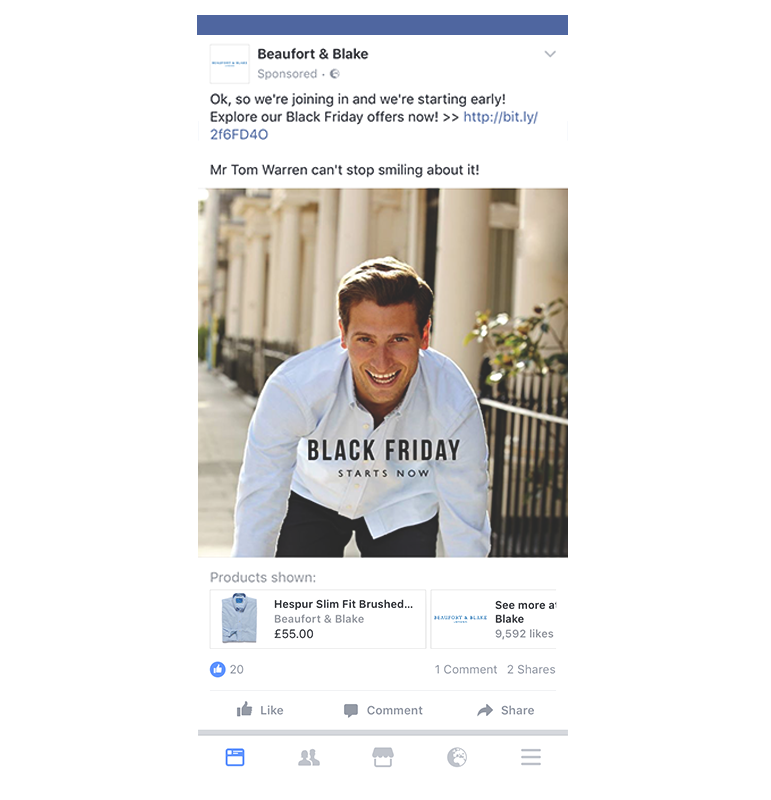
I wanted to run through why this ad stood out for me, not just as an appealing promotion of their products but as a great example of how to advertise on Facebook. Here’s the ad as it would appear for most people, on a mobile device:
Let’s start with the basics, the caption. It’s short – good. No one needs to be bored by your ramblings so cut to the chase. It’s also quite playful. Sometimes your captions can put people off by being too salesy or too serious. This communicates the message, “we’ve got Black Friday deals” without using horrible phrases like “SALE ON NOW” or “BIG DISCOUNTS!!!!”. And most importantly, it has a call to action, in this case a link to their Black Friday deals. Far too often I see an ad that probably has quite a good message that I am actually interested in, but there’s nowhere for me to explore further. And we are a lazy bunch so if you don’t spoon feed us, we’re not likely to work it out for ourselves.
Next, the image. Having a photography background I always appreciate great imagery. Yes, this photo is cheesy. But it’s well composed, the lighting is nice and it mirrors the playful tone in the caption. Facebook limits the use of text in your ad’s image to 20% so they’ve kept their graphic nice and simple, on message and very clean.
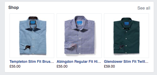
Finally, they’re making use of a new feature within Facebook advertising that lets you list particular products along with their price.
Although you don’t get any word count other than the product title and brand name, it still provides some vital information to the consumer. By displaying the pricing of your product you immediately qualify the traffic that clicks through to the website. Those that wouldn’t want to spend that much on the product are less likely to click on it and vice versa. When using a cost-per-click advertising model you want to make sure that the users being sent to the website are likely to convert. This also appears on their Facebook page as a shop section. Great feature.
So, bravo Beaufort & Blake! I will certainly be showing this example to my ecommerce clients that aren’t already using this feature and hopefully other advertisers can take a leaf out of this book to step up their own game. If you’re interested in finding out more about social media advertising, do send me an email or check out the rest of our website.
Visit beaufortandblake.com to see their full range (and guess what, they haven’t even sponsored this article).
HCW.


