Black is the new Blue
10 May 2016
By H
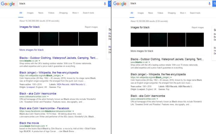
Controversially, Google have very recently tested a difference in the colour of their SERP font which has seen a majority rule in disfavour.
The new Blue to Black format that some users have been experiencing has caused mildly irritable shockwaves within the global digital community with one twitter user claiming:
Seriously Google this black links thing is killing me it’s like the guy from Bauhaus is wailing all my search results at me
— Gregor Stuart Hunter (@gregorhunter) May 9, 2016
They were asked to comment about this tested change to the trademark blue for hyperlinks and only came back with the adequately vague comment that “we are constantly testing new ways to improve the user experience, and this is just one of those many tests”.. But for which users exactly?
One theory we have at The Click Hub is to see what effect this has on click-through rates; given that hyperlink text defaults to blue, most internet users associate blue text to links so what will be the user’s next action when the SERP snippet text is uniform colour and more ambiguous?
Or perhaps it was just a glitch that our mysterious internet oracle has dubbed as a test ?.. Probably not.
It seems that Google are actually very conscientious about the changes they make to their text, with their “50 shades of Blue” A/B test a few years back earning them a cool £138 million. This is similar to some of the A/B testing techniques we use when optimising website conversion rates.
Looking at the backlash from Facebook, Twitter and Reddit users alone, it is unlikely that this is a change that will permeate our beloved search engine but it’s interesting to see such a wave of reaction to such a minor change.
Discuss.
LS – get in touch.
