Mobile-First, Not Mobile-Only
03 October 2017
By H
Depending on how you measure it, mobile devices surpassed desktops as the leading digital platform at some point between 2014 and 2017. Although there are variances between the number of users, percentage of traffic or number of ‘digital minutes’, the underlying trend is clear: the internet is now consumed more on mobile devices than it is on desktop. However, not all user behaviour has made the switch and understanding which behaviours are staying on desktop – and why – is key to a successful digital marketing strategy going into the mobile-first age.
Mobile-first
As mobile devices capable of browsing the internet have rapidly become more popular, the digital world has been gearing up for the day when mobile is more important than desktop. The term ‘mobile-first’ was first discussed in website UX circles at the dawn of responsive web design – the style of coding where websites would adapt to whatever device the user was on. The term rose further in prominence when Google announced that it was getting more mobile searches than desktop and was adopting mobile-first indexing: its algorithms would start assessing mobile rather than desktop versions of websites to rank them in search results. As a result of this shift, websites which were not mobile-friendly saw a huge drop in their rankings. Whereas before, when mobile was a secondary consideration for web design or digital marketing, there is a wide consensus that your approach should now be mobile-first.
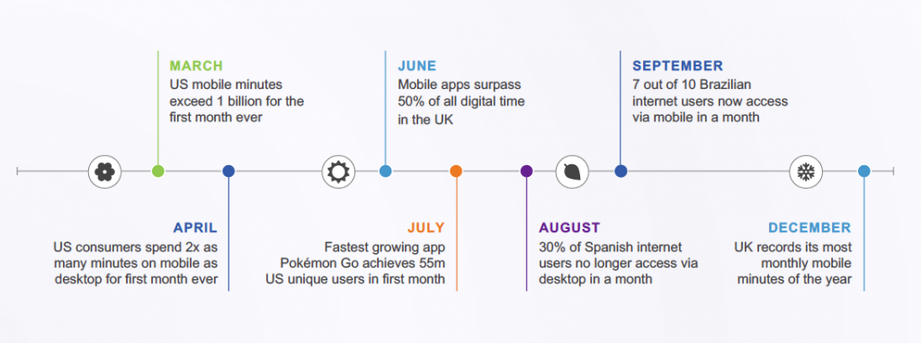
2016 saw several milestones for mobile internet usage, all following the trend of a mobile take-over. Credit: comScore
But not mobile-only
Not all metrics are following the trend. Data from SimilarWeb suggests that people still spend more time browsing sites when they are on a desktop device. This is backed up by a recent study by comScore which found that, although mobile audiences were greater, time lags behind desktop. This would indicate that mobile usage largely occurs at the discovery stage of the sales funnel, a stage where users are finding brands, products or services for the first time and are not yet researching in great detail.
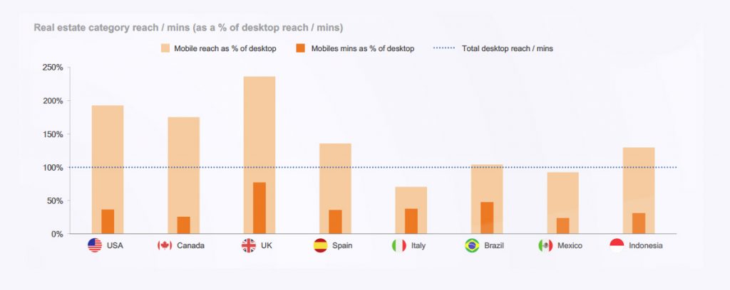
Mobile reach generally surpasses that of desktop, particularly in the UK. However, we generally spend less time browsing when we do so on a small device. Credit: comScore
A typical purchase pattern that I think most people will be familiar with is discovering a brand or promotion and subsequently carrying out initial research on our mobile devices. When it comes to further exploration, and eventually purchasing, however, we prefer to switch over to desktop. Therefore, it’s perhaps misleading to advise a simple approach of prioritising mobile. Instead, we should consider that the majority of users utilise several platforms throughout their decision-making process, typically starting on mobile but moving over to desktop further down the sales funnel.
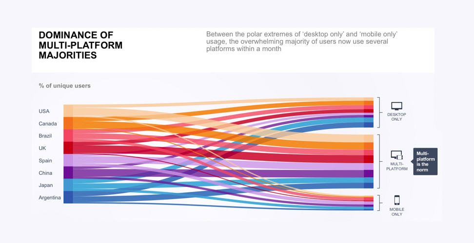
Between the polar extremes of desktop-only and mobile-only usage, the large majority of users now use several platforms within a month. Credit: comScore
Mobile-browsing, desktop-buying
What this consumer behaviour means, then, is that there is a substantial gap between mobile’s share of consumer time and money spent online. Generally speaking, we are still more comfortable completing our purchase process and converting on desktops. ComScore refers to this as the “m-commerce gap” and suggests that retailers should be doing a better job of capitalising on mobile users. Their research identified some of the key reasons why consumers don’t convert on mobile.
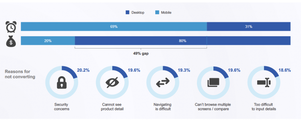 Research by comScore identified both the gap between total time spent on a mobile device and the revenue of mobile conversions compared to desktop. They label this the “m-commerce gap” and solving this is the key to harnessing the growing mobile market.
I would imagine you can empathise with some (if not all) of these and they are not new problems. In fact, there are already some elegant solutions available. For example, at a recent talk I went to, the e-commerce manager for outdoor clothing brand Finisterre talked about the importance of cross-device wishlists. These are incredibly effective in helping users revisit products when switching between devices, particularly on websites which have markedly different mobile and desktop layouts. Additionally, there are some clever plugins for Shopify, such as Covet Pics, which add your Instagram feed to your online shop but have direct links to the products featured. This means that users who initially discover products they like via Instagram, can more easily find them when they visit the retailer’s website on their desktop. All of these aim to bridge the gap between users discovering and browsing on their mobiles, but buying and converting on their desktops.

Some of the neat solutions to enabling better cross-device conversions include keeping consistency between the content people engage with on mobile and what they see on desktop. Credit: CovetPics
Interestingly, security concerns are still a major factor in killing off mobile conversions. This is contradictory to the rise of mobile banking. Although users are not totally happy with entering payment details to a website on their mobile, they are happy to directly manage their personal finances. This is perhaps explained by the fact that mobile banking is typically managed through an app – something which is inherently mobile-first in its design. This is mirrored by food retail, where food purchasing has outpaced the growth of general mobile usage as consumers turn to their mobile apps to order takeaways. My interpretation of this is that the mobile-first nature of app design satisfies consumer demands for navigability, viewability, and data entry – all of which create a better mobile UX and outweigh security concerns. Perhaps if this approach was applied to web design, we would see an increase in mobile conversions.
Mobile’s future
Eventually, it will be mobile-only. In fact, the whole time I’ve referred to ‘desktop’, that typically now means laptops, which are technically mobile devices themselves. But in this context, the line between smaller mobile devices and larger ‘desktop’ devices will blur and eventually fade. Once mobile UX satisfies the concerns around security, navigation and data-entry, there won’t be a need to differentiate between devices. For now, we should work towards a mobile-first approach, but take that to mean that your consumers will likely discover your brand, products or services on their mobiles, before later going through the exploratory and conversion phases of the sales funnel on a desktop device. By understanding the differences in how and when your consumers are using different devices, you can adapt your marketing strategy to match. For example, consider the times of day that people use different devices when you are bidding on Adwords or paying for social ads.
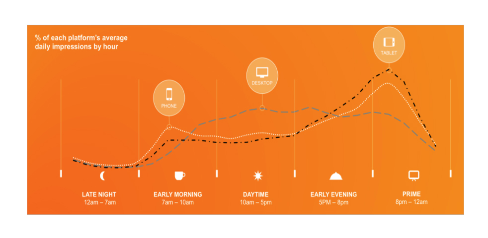
Your digital advertising performance can be enhanced by better understanding the times of day your audience are using different devices and adapting your content to match. Credit: SmartInsights
Think about the type of content people want to consume on a smaller screen and at the discovery stage of the sales funnel, and use that to reach them initially. Then opt for methods like data capture, email marketing or display remarketing to target them later on when they are on their desktop devices and bring them back for the exploratory and conversion stages. And in the meantime, if you find a way to quash users’ concerns around security and UX on mobile, keep it to yourself as it will make you very, very rich!
HCW.